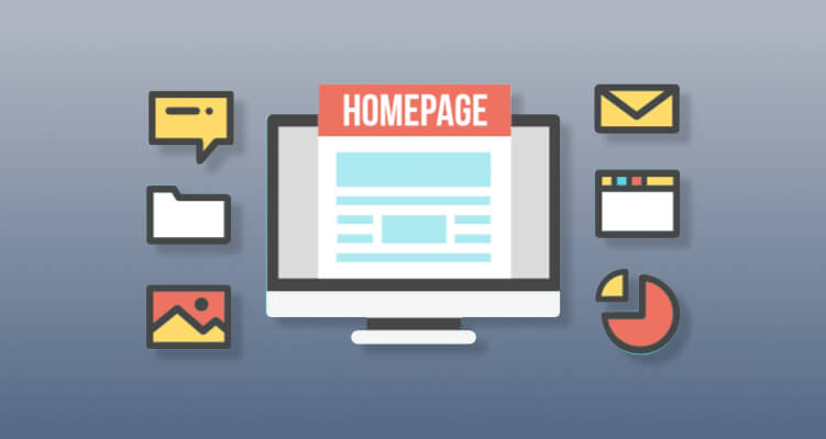
Your website and homepage is akin to the front door of your business—you want people to come in, feel at home, see where they need to go for more, and leave with a sense of what you’re all about. It’s also you first impression and chance to make an impact. There’s no point in designing a new website unless it has a great homepage that not only attracts customers but guides them to where they need to go, whether its a form fill, email signup or even an e-commerce checkout. Think about your own browsing habits—if you hit a link to someone’s page and it’s confusing or unhelpful, you’ll simply hit the back button and choose someone else. You really don’t get a second chance at a first impression when it comes to conducting business online. Like picking the right outfit for an interview, a homepage can communicate a lot of information with just a little bit of effort. Put your best foot forward with our six recommendations for building the best homepage possible.
1. Identify Your Main Goals

Ideally, your homepage needs to perform three main functions: introduce visitors to your brand, provide clear paths to other pages on your site and incorporate memorable logos or images. Keeping these objectives in mind can help clear the path to a great homepage—it’s easy to get overwhelmed by the wealth of suggestions and approaches that are out there. Focus on a simple brand message, easy to follow links to your other pages, and putting your personality out there. One way to make sure your main goals are being met is to get some feedback from a few select visitors—you can forward your page to a few friends and ask if they know what you’re selling, if they remember a picture or logo you have on the page, and if it’s easy for them to link to your call to actions or other services. This feedback will ensure you’re hitting the mark!
2. Less is More
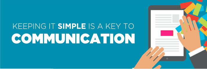
When you’re designing your website home page, one main style element to keep in mind is that less is more. You’re excited about your business so it makes sense you want your clients to get all the information and buzz at once but in reality keeping it simple is a key to communication. Make sure the text is easy to read (no green on black please!), that there is plenty of white space surrounding your one or two hand-picked logos or pictures, and that the sections customers can click on are clearly labeled. You want the navigation to other pages to be simple and easy to find—both by potential clients and by larger search engines. For instance, while drop-down menu navigation is popular, it actually makes it harder for search engines to link to your page. So consider another option like buttons on the top or click-through images as opposed to a drop down menu.
3. Above the Fold
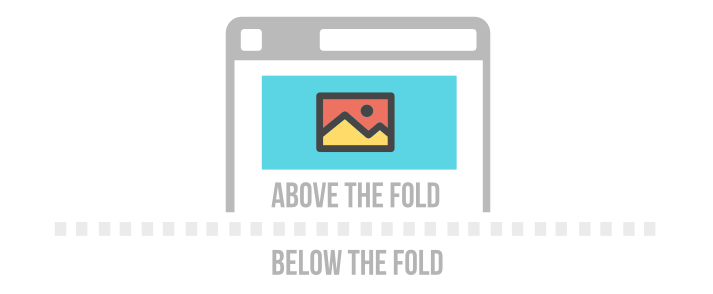
“Above the fold” refers to what you see when you first click on your homepage, without scrolling down. It references the upper half of the front page of a newspaper that features an important news story—the section of the paper is quite literally above the fold. Whatever you put above the fold is the first impression of the first impression! Because we recommend you design your homepage to be functional on desktops, laptops and mobile devices, it’s important to note that what is above the fold might vary on different screens, so take some time to ensure the important info is the first thing customers see. You’ll want the name of your business, a headline describing what you do succinctly, an image or two and a perhaps a sub-heading describing your services in more detail but not much more than that to appear above the fold. Keep it simple!
4. Choose Your Font Wisely

Marketing execs and ad people know this, but you might not be aware that the fonts you choose for your website’s home page can can actually have a psychological effect on your visitors. The first step in choosing a homepage font is to truly know your business. Who are the people you are hoping to reach? If you’re an artist or offer creative services, a modern, edgy font might work while if you’re an accountant or real estate person you’ll want a font that projects stability and confidence. Your font for the title or heading might need to be bolder than the fonts you use on the rest of your page. Another consideration with fonts is consistency—avoid using too many different fonts and opt for readability over elaborate or flowery fonts. If you’re new to the website design game and want to learn more about fonts, check out this guide to free web fonts.
5. Incorporate Social Support

Including a few well-written, succinct reviews from satisfied customers is a great option to include on your home page, and an example of something you can include below the fold, usually on the bottom. After reading all about your great services and clicking on a few call to actions, your potential clients can then hear about the community that supports you. In our beautiful reptilian brains, people tend to do what other people are doing! Don’t hesitate to provide evidence that others have selected you because it makes choosing your company seem like a good choice. Some ways to accomplish this goal are to add any of the following: testimonials from clients, customers reviews, social media links that demonstrate your following, endorsements from other in your field, links to “as seen in” where you showcase media that has mentioned your company, and “trust seals” like awards, association memberships or security certificates.
6. Pick The Right Colors
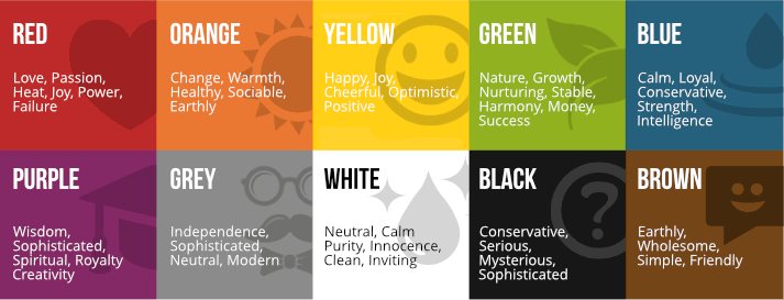
Emotions, mood, psychology—these keywords might not seem to have a lot to do with building your business online but they are actually essential to retaining visitors and clients. Keep in mind that websites are foremost a visual medium! Your choices in color and tone affect the emotions, mood, and psychology of your customers, which is what advertising and persuasion really boil down to. You are not manipulating people here, you are simply choosing colors that reflect the emotional landscape you’d like your website to convey. You’ll want to choose colors that accent each other, that don’t clash or compete, and most importantly that make you feel good when you look at them. If you’re a ballet school you might choose neutral grey and blacks with a pop of pink, or if you’re a food truck company you might focus on vibrant greens and purples of delicious veggies. Let your imagination run wild and don’t be afraid to experiment—unlike the SATS there is no “right” answer here. It might take a few versions until you find a color scheme that works for you and your brand. If this feels too woo-woo, take a look at Neil Patel’s excellent in-depth article on using colors effectively, where he references factual studies and reports: https://neilpatel.com/blog/the-psychology-of-color-how-to-use-colors-to-increase-conversion-rate/.