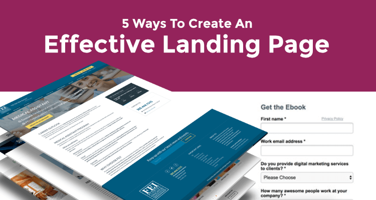
What is a landing page anyways and why should I care? Well, I am glad you asked. A landing page is the first thing customers see when they click to your website; it can be a services page or form fill page. Depending on your business, your landing page can be a pitstop to guide consumers toward subscription, a form fill page or a specific deal. It can be your main home page for the website or it can be an inner page, meaning a page that is not your homepage.
In either case, a simple design, well-chosen colors and images, and succinct descriptions of what you’re company, product or service can help you get the click-throughs and contacts you desire. An effective landing page should be mobile friendly, easy to read and understand and allow visitors to see what they are looking for and act easily on deals or purchases even on the go. A landing page does not have to “sell something” it can be a static content page, a form fill page or even a signup page. Now let me explain five solid methods for designing content for the perfect landing page.
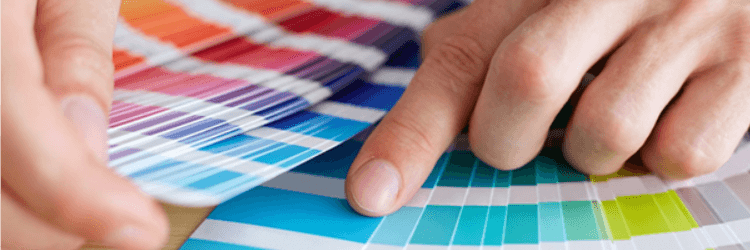
Choose The Right Colors
Advertisers the world over know the importance of the right colors for your brand. (Hello golden arches!) Choosing the color scheme that best communicates the style of your business can be an effective marketing tool, not to mention insightful and fun. Try using a website like this one empower yourself with color to find out more about what different colors can convey. If you’re a sustainable cleaner, for instance, greens and browns might suit you best whereas a restaurant might try a bold red, yellow or orange. As long as your text remains easy to read, the sky’s the limit!
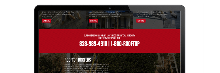
Make Strong Call to Actions
Making it easier for customers to reach you and pay you is what call to action buttons are all about. Your homepage is a perfect place to connect your consumers to your services. A donation, paypal, subscription or contact call to action can be placed right on your landing page to guide clients and contacts to the appropriate or desired page.
Streamline Fonts and Style (Less is More)
While your color scheme and content can really showcase your personality, font and style is where you’ll want to keep things simple, readable, stylish, and accessible. A common font that customers can read on any device will do wonders for streamlining the look of your landing page—the first page customers see when they click to your website. Bold, clear and classic fonts do the best work for you in this space.

Highlight Your Offerings
Brief descriptions of your main services belong on your landing page. You can add pages that go into greater detail or cover different aspects of your business, but some nice, clear content telling people what you’re about in one shot will increase the viability of your website. Hooking someone who visits your site can be accomplished by simply highlighting your offerings on your landing page.

Add an Easy Sign-up Option
One crucial add on that increases the effectiveness of your landing page is an easy email sign up so that you can see who’s interested in what you have to offer—even if they’re not purchasing at the moment collecting an email address will be VERY valuable in your business as the months go by. If I have learned anything about internet marketing, its build your e-mail list from day one. If you prefer, you can add an easy sign up option that links folks to your blog, newsletter, free download, paid product page or a contact page. Either way, it’s a good way to gauge how you’re doing in reaching the right audience.
Before we go, I want to show a few examples of a perfectly designed landing page
Asheville Screen Printing has an excellent example of landing pages from the homepage to the services pages. Take a look at these and let me know what you think. Homepage landing page , they services pages are also great landing pages. I really like the design of the apparel options on how it explains different printing types, product descriptions and much more.

